
Departments
Search
Follow Us
Tags
Latest Highlights
IBH

Underwater Worlds – colour inspiration
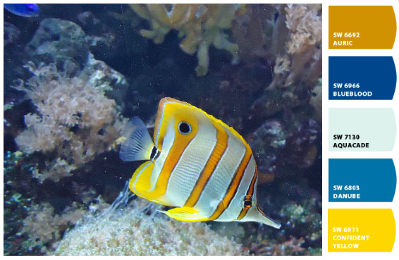 Welcome to the second in my colour inspiration series of blog posts. I shot these pictures back on October when I took my little boy to London Zoo for his 2nd birthday. He definitely takes after Mummy because he was completely fascinated by the beautiful fish in the aquarium. This first image is of a Copperband Butterfly fish. I’ve sampled colours from the picture using a free app called letschipit.
The pallet I’ve pulled from the image is curious mix. The top two colors, tan and blue, sit fairly well opposite one another on a colour wheel, the next two blues look to me to be a tint (mixed with white) and a tone (mixed withe grey) of the first blue and harmonise beautifully. The last bright yellow gives the whole palette a lift and on this collection feels very pleasing.
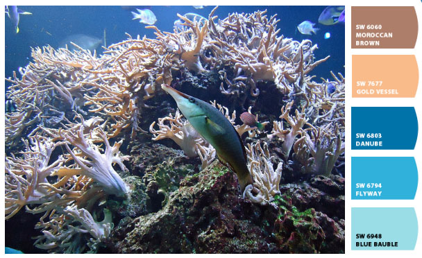
My second image for the aquarium is a snap from one of the reef tanks. The blues here are a colours that I am instinctively drawn towards and work with often. I love pastel shades of blue, especially those that tend towards teal or turquoise just ever so slightly. I would never have thought to mix them with delicate flesh tones and light creamy chocolate browns so plenty of food for thought there.
I’d love to see some of your favourite or most challenging colour palettes so if you blog please leave us a link.
Jo x
Tags: buy handmade, color inspiration, creative inspirtation, Handmade, Handmade Artists, Handmade Products, inspiration
Posted in Creative Breakroom
2 Responses to “Underwater Worlds – colour inspiration”
Leave a Reply
You must be logged in to post a comment.
Great inspiration! Thanks Jo 😀
Love those color palettes. I like you am instinctively drawn to the second image blues as well toward the teal. Putting them with browns etc, what a wonderful idea. Got to get the colored pencils out.