Departments
Search
Follow Us
Tags
Latest Highlights
IBH
Finding Inspiration for Combining the New Colors in your Craft
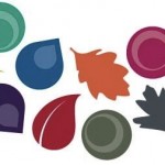
Ever since I posted the Pantone Fall 2013 color palette, I’ve heard from readers saying they are having difficulty combining the colors in their work. I have a 3 word solution to that dilemma. “Take a Walk”.
Just glancing at the color swatches, it does look like an odd group to combine and coordinate but if you take that palette outside, you see those colors working together naturally. Yes, it’s spring, not fall, but these hues are combined in nature all over the place.
 Head out for a walk with these color swatches and a camera (or smart phone) and see how many places you can find at least 3 of these shades together in nature. If you live in the city and you don’t have a lot of parks around, go to a conservatory and look around. Take some photos of places you find these colors in combination and then head to your bead, yarn or fabric shop. Grab a handful of whatever medium you use, combining a couple of these shades and you’ll be delighted at the outcome.
Whether you work in gemstones, wool, glass, paint or paper, I’ll bet you can come up with some pretty striking creations using this palette. When you do, please send photos and share with our readers.
Tags: art, craft, Fall color palette, Handmade, Handmade Artists, inspiration, Pantone
Posted in Handmade
4 Responses to “Finding Inspiration for Combining the New Colors in your Craft”
Leave a Reply
You must be logged in to post a comment.


that a great suggestion to find inspiration, but I have always wondered you decides the “colors of the season”. they don’t look that much different from one season to another…at least to me. lol
Debbi
–yankeeburrowcreations
Debbie, there are such subtle differences in the hues. One way to really see it is to go to an apparel shop where they are hip and stylish and you see that the olive of one year is slightly more yellow or brown than the year prior. Reds are obviously either more orange or blue and blues have either a green or purple tint. So, depending on what you create it’s of difference significance. For example, with jewelry or wearable art, you need to be pretty complimentary with the latest palette but if it’s home accessories, you might have more leeway because people don’t change their home decor seasonally. It’s really all about the fashion industry being able to convince consumers that they have to buy new clothes every year.
Great tip Terri… Color is everywhere.
Funny thing is sometimes I will see a framed picture and BOOM… I see a color combination. Or walking in the mall, someone passes me I can create a color combination from their outfit. But when I see the combination (in my mind) I have to write it down or I will forget. Freaks my Mom out, because we’ll be chatting and all of the sudden I stop talking and start writing… LOL
It doesn’t happen all the time, but 60% of the color combinations used to make my bracelets were created this way.
Thanks Terri
I love color! Black and White and I like Black and White also, and did I mention I wear a lot of Black and White 😀