Departments
Search
Follow Us
Tags
Latest Highlights
IBH
What are Your Pictures Saying About Your Work
 A picture is worth a thousand words. Truer words were never spoken especially when you are trying to sell your hard work online. Nobody is saying that amazing pictures are easy, you just have to spend a few minutes in most any craft/sales forum and you will find a thread about how to improve their product pictures but please know that the effort is well worth the work if you are planning on making your business a success. You have about 1 second to impress a potential buyer when they stumble upon your work online…so does your pictures entice them to read the full listing? Why or why not?
First off all, the best advice I was ever given was to spend time browsing handmade sites such as HandmadeArtists, for a product in the same category as your own product. Let your eyes wander the page and make a note of which pictures your eye stops on. What do these images have in common? Now, what is it about that image that grabbed your attention? Now, look at the images that your eyes passed over, why did they not stop you and make you take notice?
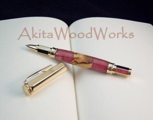
Clarity…are your pictures clear? You are selling online and your customer can not pick up your handmade treasure and hold it in their hands, taking in every amazing detail that makes it special so your pictures have to do it for you. If you image is blurry and out of focus your potential customer will most likely move on to one they can see. Again, think about your little experiment above, did your eye stop and rest on a blurry picture and beg you to click on it to get a better look? More than likely not so read the manual on your camera (I know, I know, not what you wanted to hear) and play with it in order to get the best possible shot.
Props are always tricky and can really enhance your product or detract from it. When a customer lands on your listing do they have to search for the item being sold or it is immediately obvious. Sometimes props are absolutely necessary to create a feel, brand or to show the item in use while other times they are just visual noise. If your props are causing your images to look cluttered or hide your product you may want to rethink using them. Step back from your emotions for a minute and really look critically at some of your product shots, or better yet, take one with the props and one with less or even none and ask around to see which makes a better impression. Does your eye land immediately on your artwork or is it traveling the picture looking at everything else. Crop your images to that your treasure is front and center and shown in all its glory.
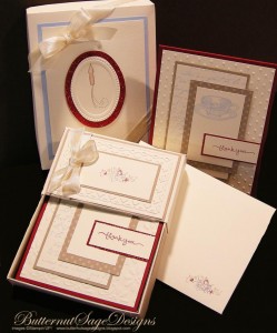
Background or lack of background is a personal opinion. Some prefer stark white while others use black while still others prefer textures and colors or natural elements. The biggest thing to watch is small details. No matter where you take your pictures or what background you use check for the details. Do you want to buy a baby blanket photographed on a dirty floor? How about if you can see dishes piled up in the background? Even reflective surfaces can show more than you planned so before you post your newest product look intensely at every detail outside of the product itself and make sure you are not showing anything that you hadn’t planned. Speaking for myself, I have had to retake many shots when I didn’t realize that the jewelry bust had lint on it or my white backdrop had a smudge…it never seems to show up until I am editing and the last thing I want to do is retake one hundred pictures, but if I can see the imperfection then a customer can too.
Editing is the final step and one that seems to cause so much anxiety for artists. There are amazing programs out there such as Photoshop that can do more than any amateur should ever need to. There are also free versions such as Gimp or the programs that often come with your camera. Whatever program you chose, you must edit your pictures. Small tweaks such as cropping to center your product or brighten up your light can immediately change the entire feel. That being said, be careful of over editing! You want your product to stand out for all the right reasons, not because the white is so exposed it seems to glow! Finding a balance can be a learning curve but well worth the effort it entails.
Product pictures are worth a thousand words and can cause a customer to fall in love or move on without a second thought. While I’ve often heard artists complain about setting up and shooting pictures (not that I’ve ever done that!) but it is a necessary part of selling your work online. You spend so many years learning your medium and hours getting your art just right that it deserves to be shown off in all its handmade glory. The time taken to look critically at your images and perfect them will eventually pay off in more sales…it is a learning process that takes time but looking back you will see how your pictures evolve. Above all, ask! Artist’s forums are full of people willing to offer tips and advice on photography and will often be more than happy to give you a critique of your images. Take the advice in the spirit it is given, again, take the emotional connection to your work out of it for a minute, and be willing to learn from those whose images you admire and you will only grow and improve.
Tags: Handmade, images, photography, pictures, props, sales tips
Posted in Selling Tips
9 Responses to “What are Your Pictures Saying About Your Work”
Leave a Reply
You must be logged in to post a comment.


It’s interesting that the phrase “a picture is worth a thousand words” is in fact, true. It’s proven science that the brain processes an image one thousand times faster than it does text. The implications for handmade artist’s are enormous. The implication is that we must ask ourselves, are we spending enough time and thought on our photo’s?
Excellent article! I dislike the ones that show 3 or more items but you’re only getting one item. I also want to be able to see the details on items – especially if it’s jewelry that has filigree, but really anything – it makes me wonder what they are trying to hide when I can’t clearly see everything and especially all sides of it.
Lo Not too long ago I retook a lot of my ornament pictures, with the ornament sitting on a glass toothpick holder, it’s so much easier to take a picture of all sides with it sitting on something. I usually put at least one picture of it hanging on the listing, but failed to with one, and a lady had to ask if it could be hung, as the hanger was inside the toothpick holder! Lesson learned! (she did buy it! YAY!!)
Great article! I use to take my photos with lots going on in the background. Looking at them now and I think that the background becomes the photo. I much prefer that the piece be the center of it! Got a little work to do but helpful articles like these make things better every day!
great post….photography is almost as difficult for me as tags and discriptions. lol
Debbi
–yankeeburrowcreations
Thanks for the excellent article. I found that my best efforts have not produced pictures I liked. The solution came in the person of a photography student who wanted to develop a portfolio that includes product shots. I used those pictures for the primary shots and I used the photos I took for the additional views.
This is just sooo important! I really hope everyone takes the time to look at their pics with their eyes open!
Excellent article. If I could hire someone to take all my pics, I would do it! I might take 10 pics to get one that I’m happy with. I have recently discovered though that the camera you’re using makes so much difference.
Luv it! Thank you for sharing with us!
Excellent article! So many of those points both good and bad I have experienced myself. It’s just a part of the job and one to put more focus into. The pun was NOT intended. 🙂