
Departments
Search
Follow Us
Tags
Latest Highlights
IBH

Primroses – Colour inspiration
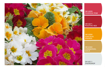
Spring is here, really truly finally here, and the primroses are all out and bobbing their smiling heads in the breeze. This months colour inspiration post brings two very different springtime colourways taken from images of this bonny little flower. The first is this warm pink and golden toned collection teamed up with a lovely off white shade. Elegant and feminine.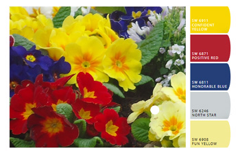
My second primrose palette makes use of bold primary tones combined with cool pastel blue and yellow.
Why not experiment with your digital art and draw colour inspiration for your crafting passions? Here are two brilliant sites to help get you started.
Tags: colors, colour inspiration, design ideas, pastel, pinks, primary, primrose
Posted in Creative Breakroom
4 Responses to “Primroses – Colour inspiration”
Leave a Reply
You must be logged in to post a comment.
oh I love the bright colors!!! shared.
Debbi
–yankeeburrowcreations
They are one of the most cheerful flowers around I think! Love them and the post! 🙂
Bright and cheery colors! So glad spring is around the corner for us, this winter has been just too long
I find Primrose growing wild along the fence line at the farm. They are beautiful little flowers.