Departments
Search
Follow Us
Tags
Latest Highlights
IBH
Picture It…Then Sell It
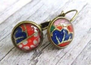 Selling online is a wonderful way to increase your market beyond the local boutiques and arts and crafts shows. You can show off your hard work to a world wide audience and have the fun of shipping your creations across the globe. But before you grab those packing boxes and peanuts, you have to take pictures, and here lies the reason that some people just don’t seem to sell no matter how fabulous their work is.
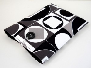 No, you do not need a million dollar camera to take your pictures with…though wouldn’t it be fun to have? Most digital cameras today come with a macro setting on them. What is this? Well, first of all it is usually symbolized by a little tulip flower. When you have this setting on, your camera is looking for small details on close up objects rather than grand landscapes to photograph. The result is that all those glorious details in your handmade creation are captured. Now, this is a wonderful thing to show off your talents, but please check your pictures! That little setting will also pick up any imperfections, lint, fingerprints that are in view; little things that you may not have noticed when you were creating or setting up your shot that will be glaringly obvious to buyers. I don’t know how many times I’ve missed closing a ring just right or a small piece of lint on my display piece only to have it glaring at me from my computer screen when I upload my images.
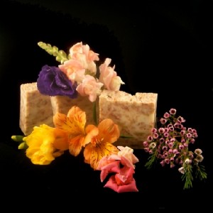
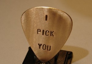 Are you ready to stage your shot? Great! What background, what color, what props? Well, that is totally up to you and a great way to show your individual personality, but there are a few good rules of thumb to remember. Keep in mind that you want your product to be front and center in the buyer’s eyes. Busy, patterned backgrounds may be beautiful on their own, but does your treasure get lost in it? Save that fun, multicolored paper covered in shooting stars for a beautiful card and chose something a bit more subdued for your product pictures. Same goes with props, while you may love that bright orange flower, does your product really show up in all its glory or is it competing with the prop? Take a critical look at your images. Close your eyes and open them to your image. What is the first thing your eye sees? Is it your product or your background or your props? If it is not your creation then maybe you should rethink how you stage your pictures.
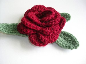 One thing that has helped me with my images (and trust me, I have a long way to go!) is by looking at other’s product pictures. I happily scroll through hundreds of pages on various handmade websites and rather than dreaming of owning that darling pair of earrings I let me eye wander the page and take note of where my eyes land. What is it about the image that caught my attention? Just as important, what is it about the others that made my eye not even take notice. I am in no way telling anyone to copy another’s staging, but doing this will give you a better idea of what to do, or not do, to best show off your work from a buyer’s perspective. Check out high end shops that sell similar products to yours and take note of how they photograph their pieces. Would Tiffany’s stage their stunning jewelry on an old quilt?
 Finally…editing. Most, if not all, photos will need a bit of work to make them truly memorable. This can range from cropping out a bit of background so that your treasure is front and center to brightening an image or adding more contrast. Many computers and cameras have some form of editing software such as Microsoft picture which you can do basic operations such as cropping and basic fixes. If you want much more editing freedom for your pictures, you can use a free program such as Picasa or a purchased program like Photoshop and really go to town with changing backgrounds, colors, lighting, etc. No matter what software you use, the most important thing to keep in mind is that your handmade treasure be shown in its best light to catch a customer’s eye. Stay true to your piece. If the background on the card is a soft purple, please do not edit it to make it a dark violet! Your customer will not be happy if the piece he receives is entirely different from the one he saw online.
The most important thing to remember is all of this is to think like a customer. If you were shopping around online would your creation stand out to a buyer? Would your pictures catch your eye as special? Take a close look at your images and forget that they are yours…what do you see and what can you do better?
Tags: Handmade, Handmade Artists, Handmade Harbor, photography, product photo, sell handmade, selling handmade online
Posted in Selling Tips
9 Responses to “Picture It…Then Sell It”
Leave a Reply
You must be logged in to post a comment.


Great info and great post, product photos will make or break a sale in a second.
Thanks for putting this article together. Photos are one reason I no longer bother selling my stuff. I can never get them to look gorgeous.
Great article! I know I need to work on my pictures and there are some very good tips here. Jewelry is so hard because it tends to be quite shiny. I’ll just keep plugging away.
Terrific tips about the importance of good photos. Thanks for sharing!
Good article on the importance of creating images of your product. Nothing turns me off faster than bad photography – blurred, too small, washed out, unimaginative angles..and so on. I immediately look elsewhere. I expect potential customers would have the same reaction.
Good Tips…I am working on it…..(smile)
Great article and very timely for me…as I will taking my photos this afternoon. Thanks you!!
Great article, very inspiring for me! Now I want to improve my photos even more! Thank you! 🙂
[…] or the idea that I might not like other pieces as much. I do. But these are the ones that were photographed in such a way that I actually had to do less work to notice and see […]