Departments
Search
Follow Us
Tags
Latest Highlights
IBH
Photo Don’ts
After selling on various sites, hanging out in forums and browsing countless handmade treasures I have heard one resounding theme….Why am I not selling? Well, there are countless possible answers to this question but one of the most common culprits of low sales seems to be pictures. Now I can hear you now, “not another know it all telling me how to build a light box!” Um, no. How you take your pictures; with a light box or without; or what type of camera you own; point and shoot or fancy SLR; is not what matters. What matters is the end result. You have less than a few seconds to grab a potential customer’s attention and if your images are not eye catching then they will move on along with their money. You could be the Picasso of wire wrapping, but people will never know it if you can’t take a clear photo.
Before we begin I want you all to know that the “bad” pictures are my own. I have no desire to call anyone out and hurt feelings so I set myself up and took my own “do not try to sell with these” pictures. That being said, here are some of the most common picture problems I have run into in my browsing.
Where is it?
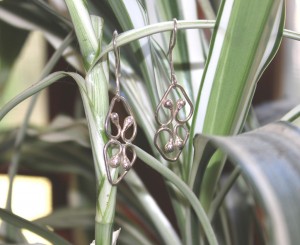
A customer is shopping, credit card in hand, you do not want to waste their time playing find the earrings. While props can certainly add interest to your photos, if your background or props are causing your customer to have to search out your handmade treasure then you may have lost a customer.
I’ve seen many jewelry artists take pictures of their treasures hanging from plants and branches and have spent countless minutes trying to make out the jewelry itself. Your work should be front and center and a browser should be able to see that product immediately without searching.
Background
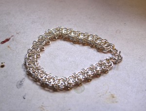
While we’ve covered props and such you still have to consider your background. Please, nobody wants to look at that darling baby blanket photographed on a filthy carpet or that stunning piece of jewelry on a scratched work table. Lint, dog hair, dishes in the background, your pets (unless you are selling pet products) or the TV are not professional looking photographic backgrounds. You may not have a million dollar set up, but by eliminating these things you can be sure than nobody else will ever know that you haven’t done the breakfast dishes yet.
What is it?
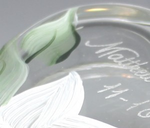
Which brings us to game number two; I understand that artistic pictures are the trend on some sites and they can be very eye catching, but do you really want your customer to have to ask themselves what they are looking at? By all means, make your images your own and part of your brand, but don’t leave your customers scratching their head.
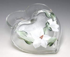
By the way, just to be fair, the image above is actually a small trinket box for a bride.
Out of focus
Now this should be a no brainer, however time and time again I run into pictures that are so out of focus there is no way to see the details. Many, if not all, cameras have an auto focus and most have a Macro setting (usually a little tulip symbol-though why a tulip I have no idea!) that will help you focus. The only way to improve this is to take a million pictures while messing with your settings, or maybe read the owner’s manual if you want to speed up the process!
Too dark
Even if you are taking your pictures in your craft room after midnight they should still show up bright on the screen. Lights, light boxes and editing software are going to be your friend. A dark picture is depressing to look at which is only fine if that is the mood you are trying to portray to your customer. If this is not the case, then you really must find a way to lighten your look.
Overexposed
Now you are not making your customer grab a flash light but their shades! Editing software will make your images as shockingly bright as you want, never telling your stop, but an over exposed picture makes it impossible to see any detail and alters the color of your piece. While brightening your work, be sure to use a critical eye and know when you stop; if you can’t do this then ask for a second opinion of a trusted friend.
This list is by no means complete but it does cover some of the most common problems that I have seen. As an artist working to sell online, your photos are your first impression so you want to put your best foot forward if you expect a customer to shell out their hard earned money for your treasure. In the end, the best advice I can give is to keep snapping pictures using various props, settings, backgrounds and lighting then learn to use one of the many photo editing software out there until you can look at your pictures like a customer and be happy with them….then work some more to make them better! Your sales will surely increase if you are willing to invest a bit of time and energy into making your photographs pop!
Tags: editing photographs, image, photo, product photo, selling, selling online
Posted in Handmade, Handmade Mode, Information, Selling Tips
8 Responses to “Photo Don’ts”
Leave a Reply
You must be logged in to post a comment.



Fabulous article! I am guilty of many of those and probably still am in some cases.
Thanks for the reminder.
And weird hues to photos too! I’ve seen so many that are yellowed out or blue-tinted or whatever. It’s terrible.
I didn’t even think of the weird hues but that is also one I see often. Makes me sad when I see a stunning piece and a horrible picture that can easily be fixed.
Great post Kimberly, thanks so much for sharing!!!
[…] Read more…. […]
Great article. I have noticed that the thumbnail of my pictures here are not as clear as they could be but when you click in I think they look just fine. I am not real sure why that is.
Thanks for the information Kimberly.
🙂
Guess site doesn’t like chrome, had to switch browsers to post. Thanks for the info, great article. Always good to see/hear what does/doesn’t work. Shared on Twitter, have a great night, everyone!
Lol, I think I am guilty of all this some times. It is a great reminder on what to look out for. I did recently get a better camera again just for this reason because everything was coming out blurry.